DiDi Food courier platform

DiDi Food courier platform

Global Design Group - UIUX design intern

Role

UIUX design

UIUX design

Illustration design

Motion design

Timeline

Jun-Nov 2025

Team

Solo design under guidance

Tools

MasterGo

After Effect

About DiDi Food

DiDi Food is a leading food delivery platform serving 100+ cities across six Latin American countries, connecting customers, restaurants, and couriers.

About DiDi Delivery: platform for courier

The app couriers use to manage their work—from accepting orders and navigating deliveries to tracking progress and earnings. By 2024, in Mexico alone, couriers have completed more than 360 million deliveries across 60 cities.

Within the app, I was in charge of courier incentive system visual revamp

The platform used incentives to balance delivery capacity across different business scenarios. By segmenting these scenarios, we could direct resources to the moments that mattered most, improving courier supply while keeping costs under control.


The initial design started small, but gradually evolved to a system level change across the entire platform

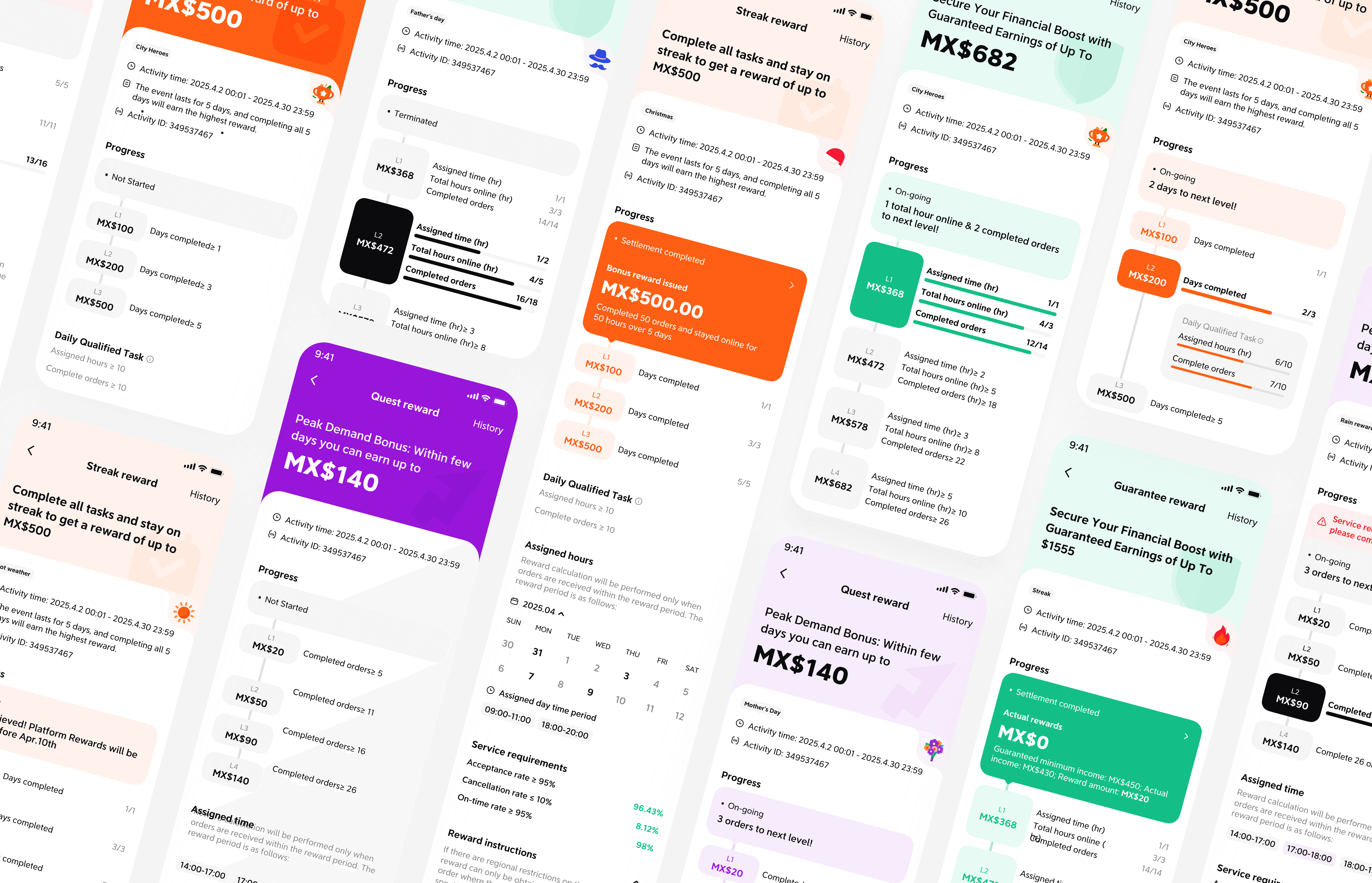
I started with 3 kinds of reward detail page

The inside page after click into a specific reward. Displays full information including current progress, reward duration duration, reward eligibility, and FAQs.

The problem

Couriers had to spent too much time understanding reward status, low VIEWING EFFICIENCY

What I found

Lack of clear information hierarchy and visual emphasis

Where I started

When I joined the task, some style and design change have already been done. I took it forward, made additional change and adapt to the overall system.

My solution

Content reorganization & visual focus; Same bone across different rewards
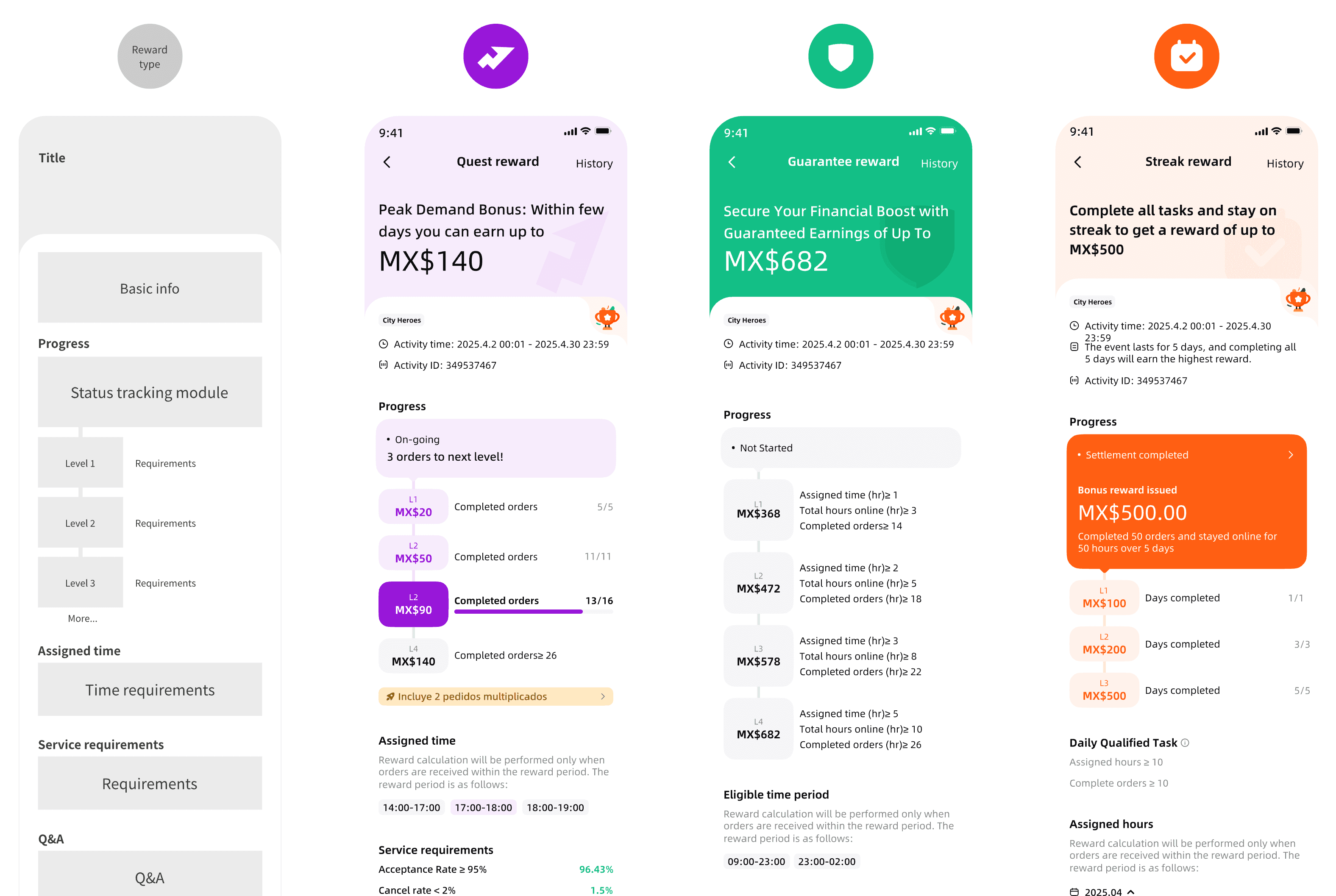
A consistent module delivering the most important info

By combining the reward status with a reward progress tracker to a fixed UI component that dynamically adapts its displayed information and functionality based on the users scenario. This allows the users always know where to find the most direct status without spending time wondering around.

By combining the reward status with a reward progress tracker to a fixed UI component that dynamically adapts its displayed information and functionality based on the users scenario. This allows the users always know where to find the most direct status without spending time wondering around.

Use color as visual guidance

Each reward has its own primary color and a lighter variant. The primary color always being used to highlights the key element that users care about the most in each states.

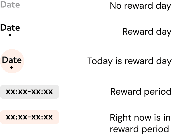
Special calendar design adaption for streak reward

Each reward has its own primary color and a lighter variant. The primary color always being used to highlights the key element that users care about the most in each states.

Labels
Earlier visual explorations

Second project: reward calendar

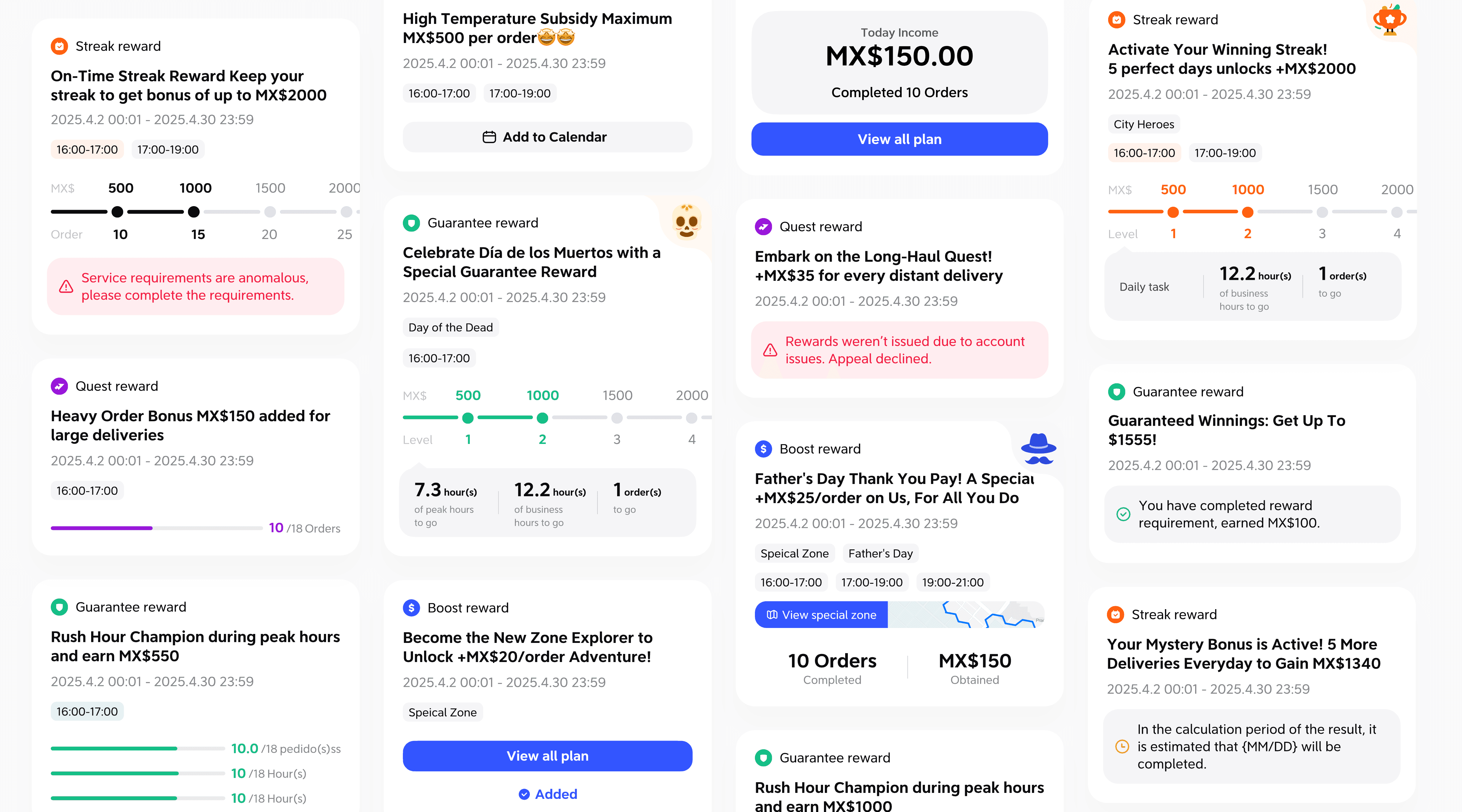
A calendar overview that allow user to efficiently manage all upcoming, active, and completed rewards, with quick access to key actions like adding new rewards and tracking progress.

The problem

Inefficient screen usage, limited reward exposure.

What I found

Lack of clear information hierarchy & organization

My solution

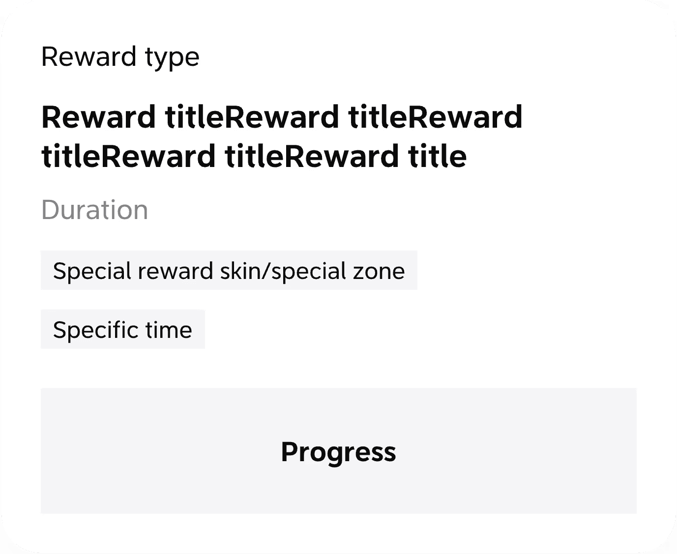
Clearer visual structural consistency across all rewards
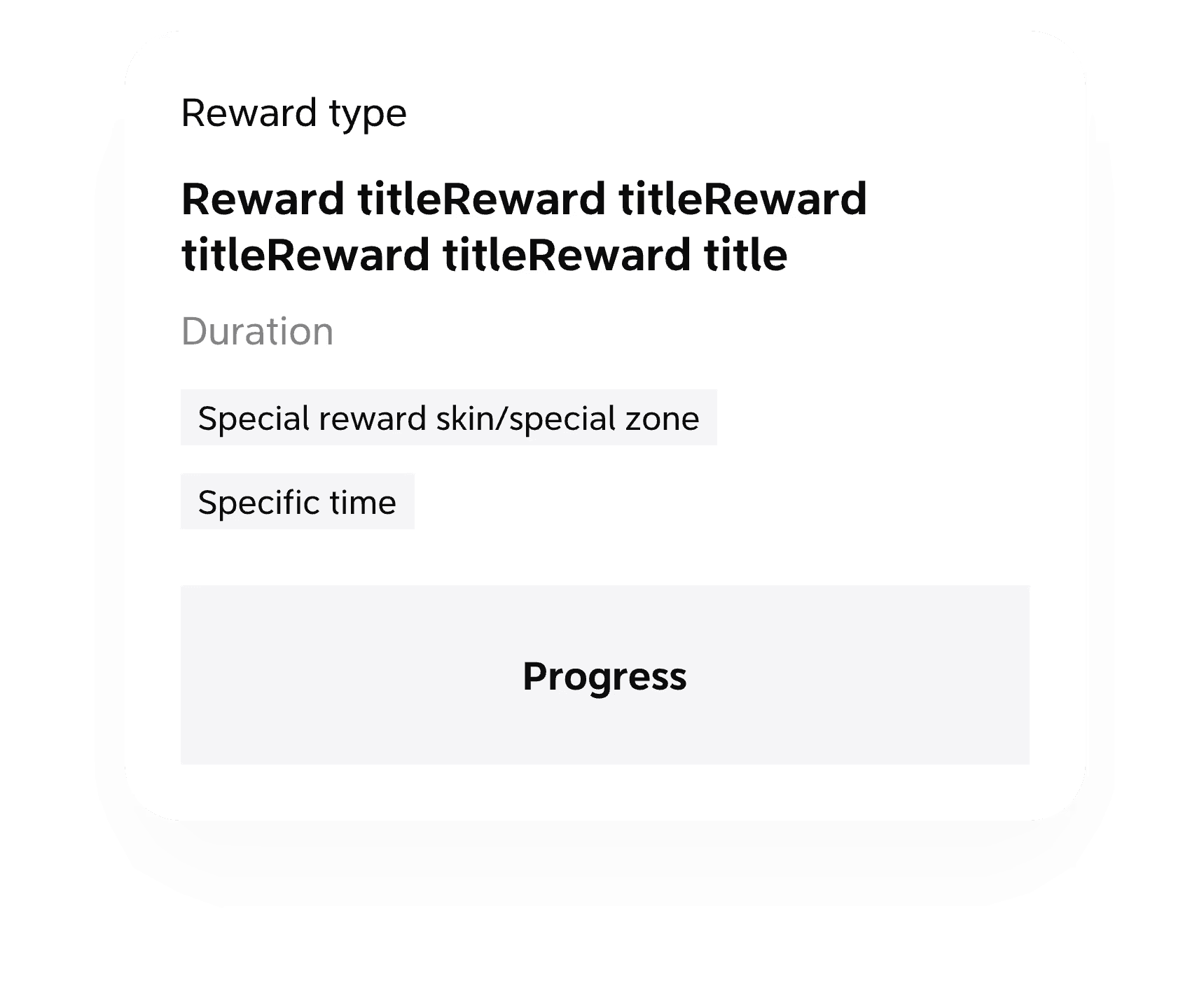
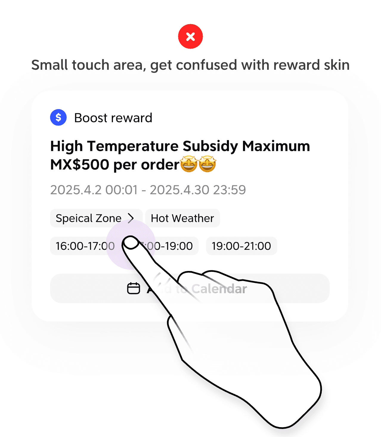
Special information redesign without disturb structure

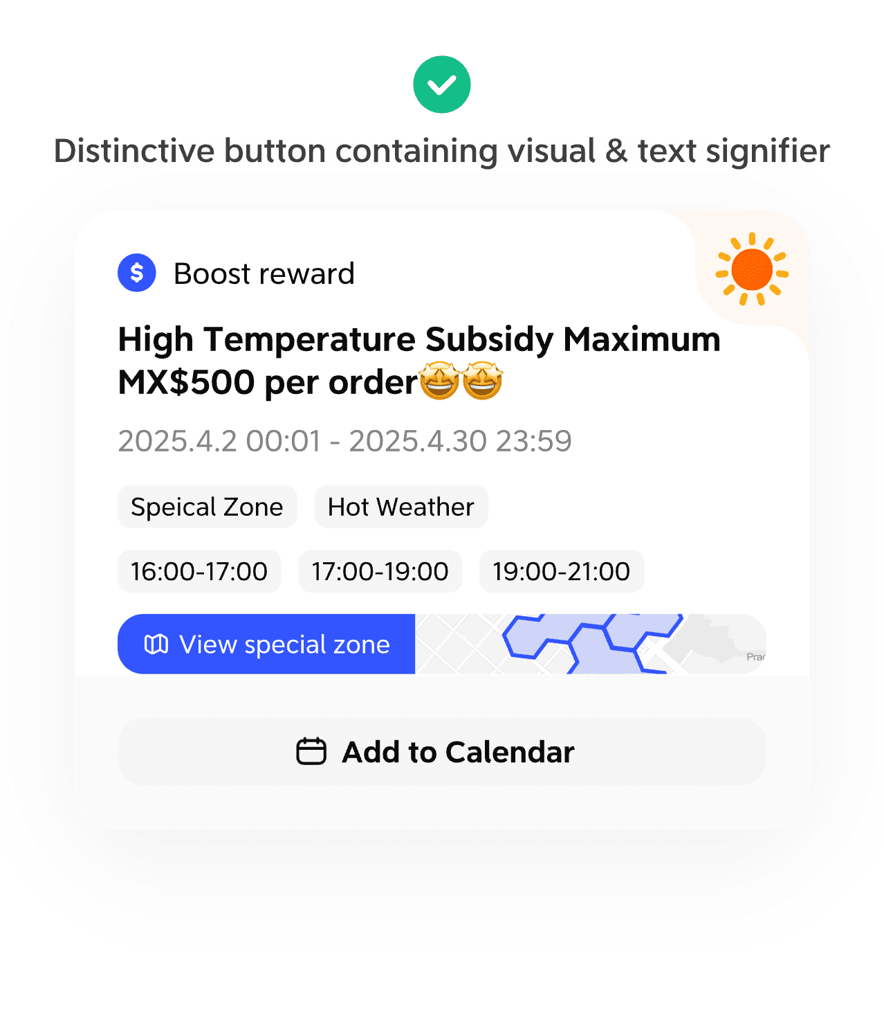
Reward with special zone allow users to click in to see the effected locations. The enter point and the label should be interrelated, distinctive enough to see without breaking the original structure.

Before

Project 3: reward skin

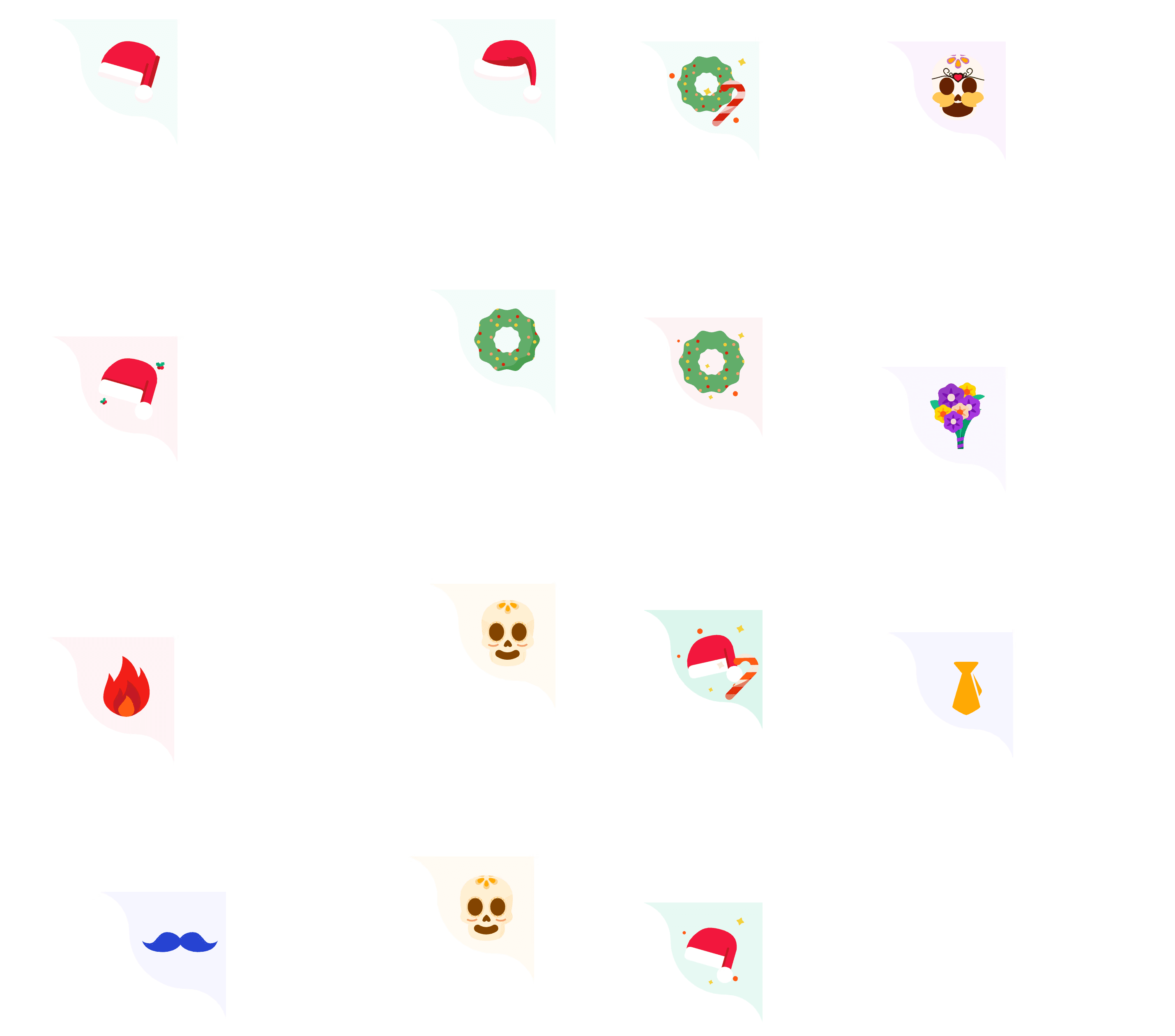
Visual metaphor of events/scenarios that indicate a special bonus come with the reward.

What I found

Style inconsistency, unbalanced composition

Research & design drafts

Final design

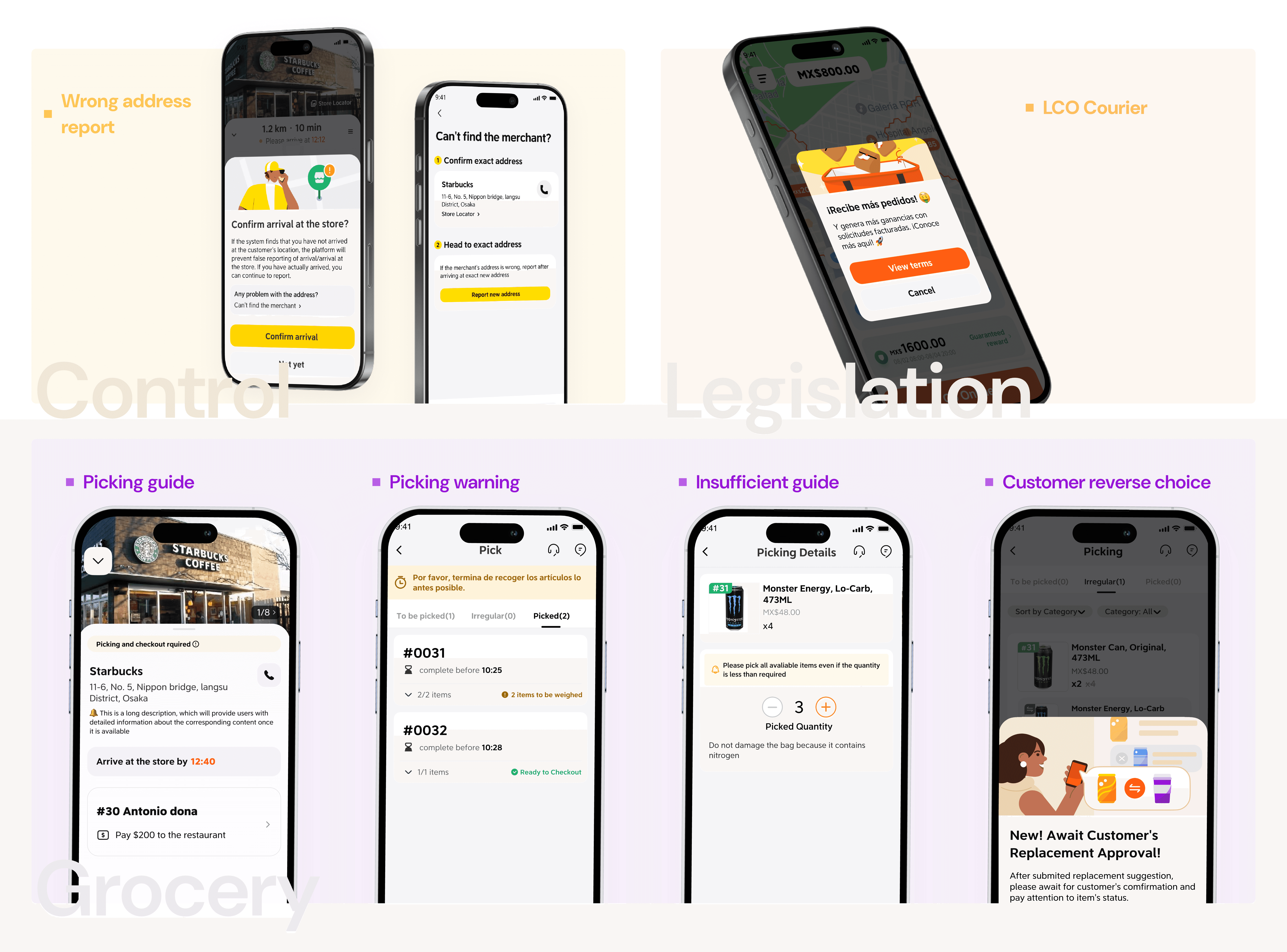
More incentive touchpoints design

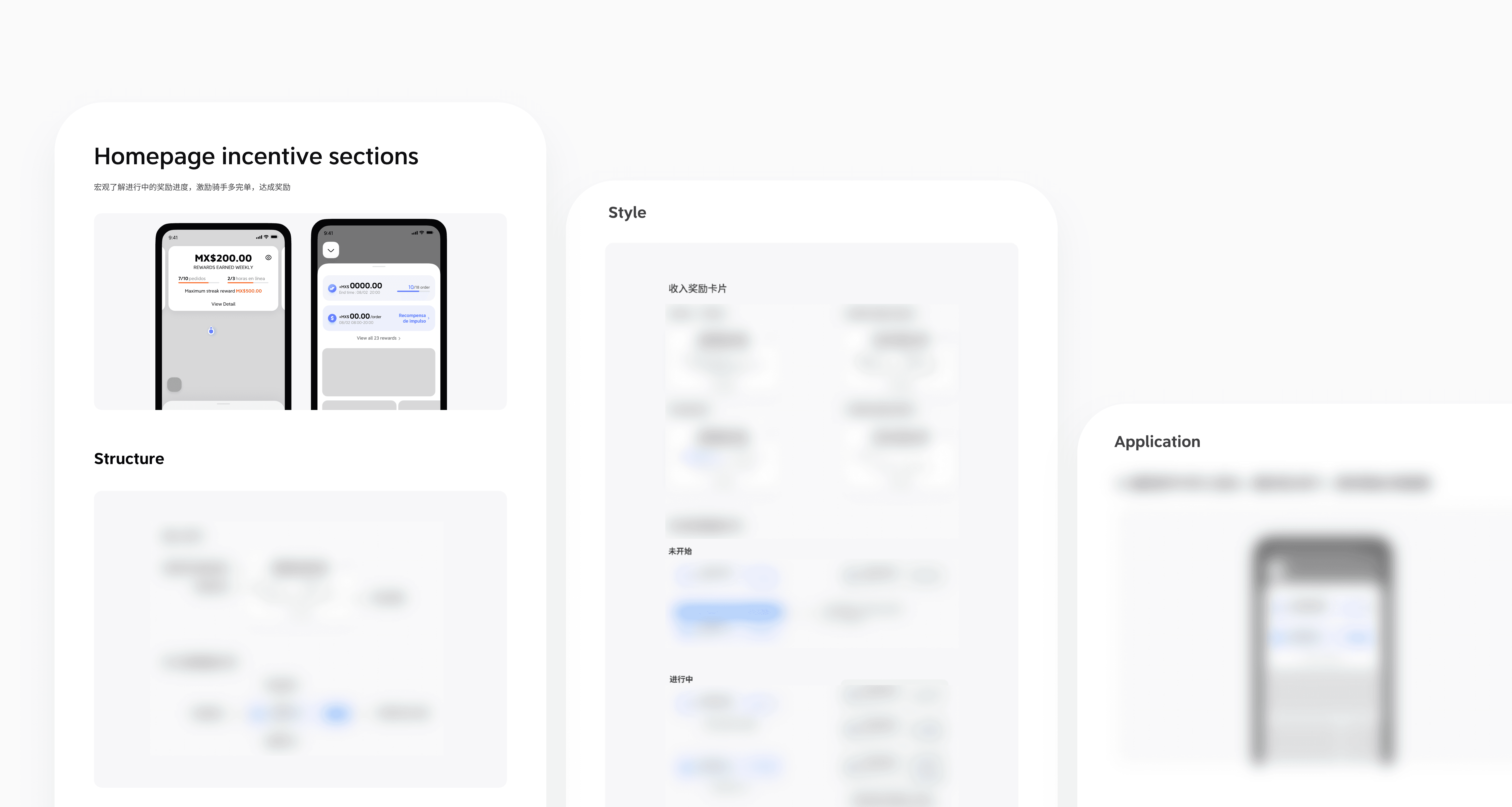
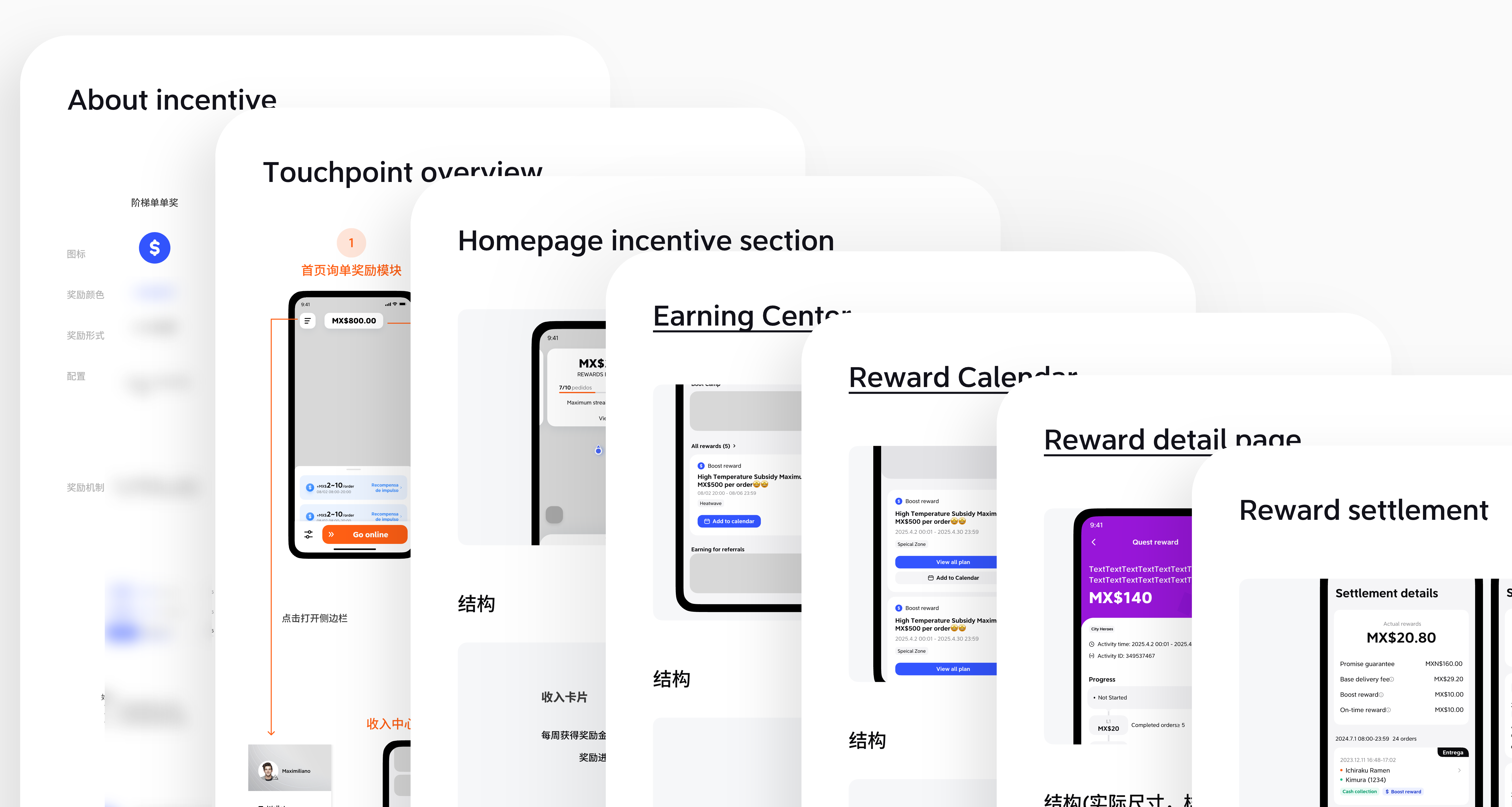
After all the work, I organized a design system for the incentive sector

Visual metaphor of events/scenarios that indicate a special bonus come with the reward.

Other design tasks I did during internship

During my 5 months internship at DiDi Food courier platform:

I designed tools and workflows to improve the courier experience across Latin American markets.

12

Design Tasks

2

Illustration Tasks

1

Design System

4

Competitive Research

12

Design Tasks

2

Illustration Tasks

1

Design System

4

Rounds of
Competitive Research

For each design task, I drove every stage of the end-to-end design process:

1

Initial Design Briefing with PMs

2

UIUX Design

3

Design Internal Review

4

Tri-team Initial Review ( with PMs & Developers)

Tri-team Initial Review
(with PMs & Developers)

5

Tri-team Final Review ( with PMs & Developers)

Tri-team Final Review
(with PMs & Developers)

6

Design Handoff

7

Design Quality Assurance

Looking back at my internship, I learned that

When to step back

Design in workforce takes more consideration of operational indicator, technical limit, real-life usecases, real user feedbacks. Learning to find a compromised solution is always happening and it's normal.

When to step forward

Collaborating with engineers, designers and PMs is both exciting and difficult. Everyone hold different perspective, proactive and transparent communication is essential. Understanding each other's point but knowing what should be persist for a better user experience.

What I learned
  • How to collaborate effectively with product managers and developers in a fast-paced environment.

  • Balancing user needs, business goals, technical constraints and work within existing design systems consistently across features.

  • Strengthened my ownership and responsibility when working on real products used by millions of users.